Senior Product Designer
Currently at
Giving shippers eyes on the road
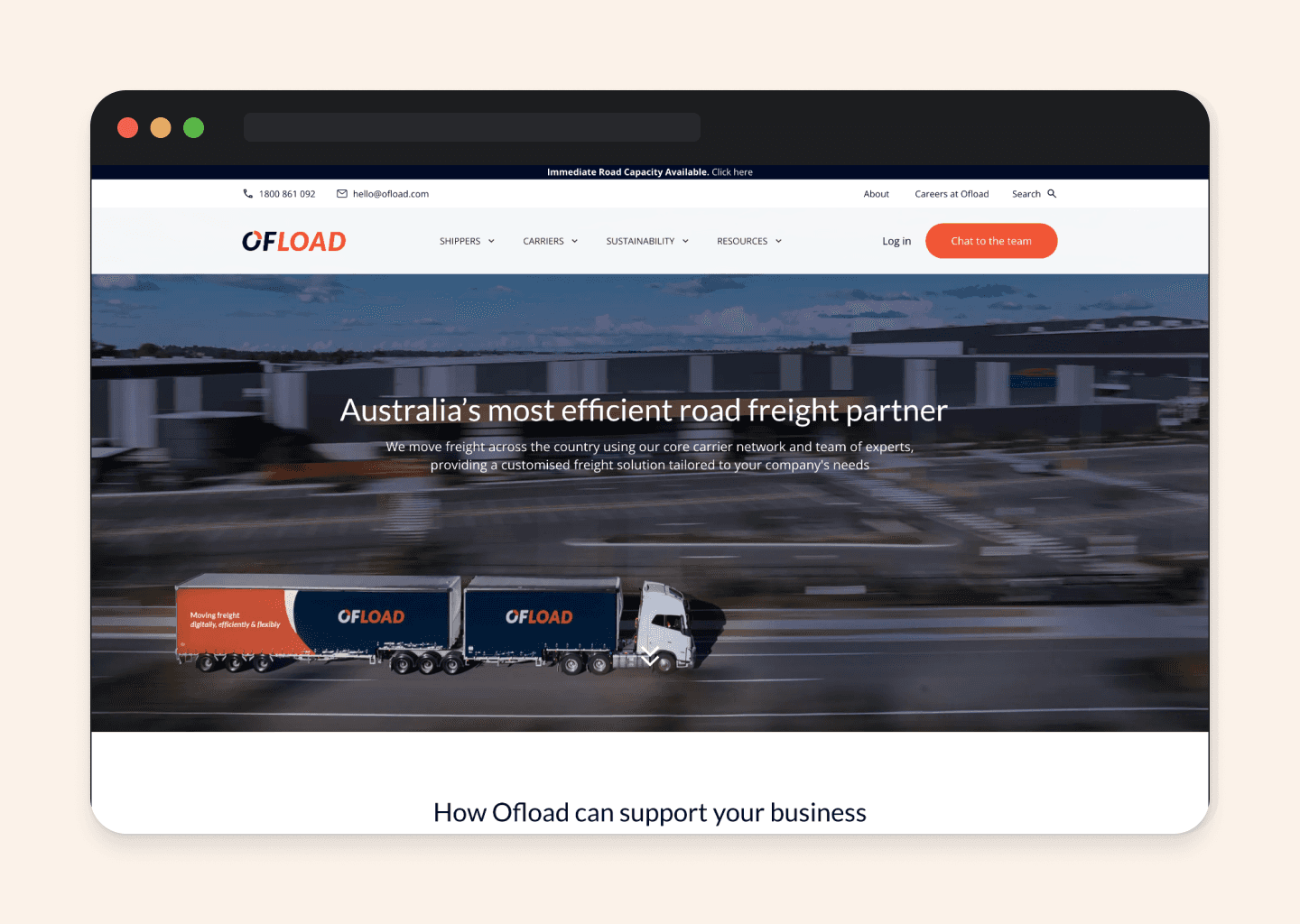
Client: Ofload
Category: Product Design

Giving shippers eyes on the road
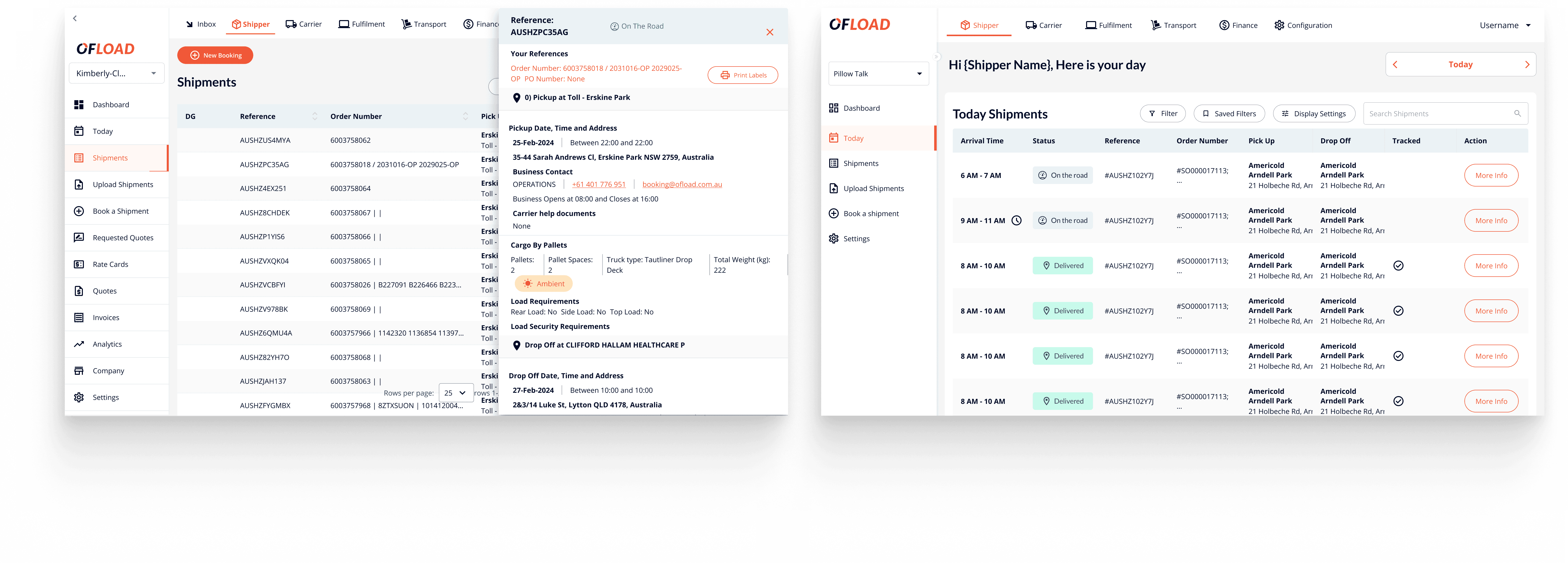
A live shipment tracking dashboard for Ofload, built on telematics data.
Ofload’s shippers could book a shipment in minutes, but couldn’t see it once it left the warehouse. I designed a live tracking dashboard that gave them real-time visibility, piloted with Sun Rice, and set the foundation for Ofload’s DIFOT and dynamic ETA roadmap.
About Ofload
Ofload is a road freight management platform connecting large shippers with carriers across Australia. Shippers use it to book loads, track costs, and manage fulfilment at scale. By mid-2023, the platform had visibility gaps that were hurting its core promise: shippers could book a shipment in minutes, but couldn’t see where it was once it left the warehouse.
Shippers were flying blind
Our shippers are seasoned logistics professionals. They manage procurement, operations, and distribution for some of Australia’s biggest consumer brands. Their customers expect precise delivery times. Their warehouses expect accurate arrival windows. Their finance teams expect reliable DIFOT reporting.
None of that was possible with the tools they had. To check on a shipment, they phoned the carrier. The carrier phoned the driver. The driver sometimes answered.
This wasn’t an Ofload problem alone. It was an industry-wide gap, and closing it was our chance to become the platform shippers actually relied on.
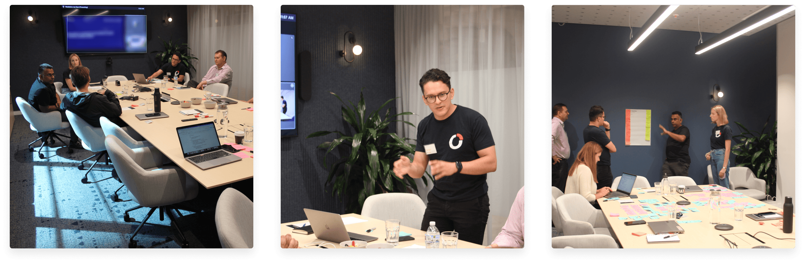
A workshop with the people who’d use this
Before designing anything, I ran a full-day workshop with four shippers from different industries. I wanted to understand two things: how they experience peak-season pressure, and what they actually think about real-time tracking tools.
The Panel was structured the day around three activities:
Panel one: how shippers cope during peak periods
Panel two: their experience with existing tracking solutions
Brainstorm: co-designing what a better tool would feel like
Three things became impossible to ignore
What I was working with
Before I could design anything, I mapped the constraints. This wasn’t a greenfield project. We were bolting real-time tracking into an existing platform, on a budget, in two months, with a design system still being rebuilt.
Timeline: 1 month design, 1 month development.
Money: Every Google Maps API call costs us, so the design had to be efficient with requests.
Design system: Core components needed to land in the system before this feature could use them.
Integration: A brand-new telematics partnership meant data shape and reliability were both unknowns.
From research to a shape
With the insights and constraints on the wall, I started mapping how the experience should flow. I focused on three user journeys:
How a carrier registers their telematics-equipped trucks
How they assign a truck to a shipment at the start of a job
How admins and shippers see that information on the platform
I mapped each flow against the dashboard states: empty, default, shipment-selected, multi-stop, past shipments.
Pressure-testing the thinking
Before going into hi-fi, I wire-framed every state of the dashboard and every step of the carrier onboarding flow. This let me test the information architecture with the team before committing to visual detail.
Wireframing at this stage also surfaced questions I hadn’t thought through yet. What should the map do when a shipper has no shipments in transit at all? How do we handle a shipment with no telematics device assigned? Each gap became a design decision.
The final interface
The dashboard had to do three things at once: show live truck positions on a map, surface the day’s shipments in a scannable table, and handle every state from empty to multi-stop.
I designed seven dashboard variants covering every scenario: empty state, clustered shipments, close-up view, selected standard shipment, not-tracked shipments, super-dock or metro routes, and past-day views. A responsive mobile version rounded out the set, since many shippers work from the warehouse floor.
Bringing it to life
I built a high-fidelity prototype covering the key flows: entering the dashboard, searching a shipment, selecting one, viewing the route, and toggling between tracked and non-tracked views. This became the artefact we used to walk stakeholders, engineers, and our pilot customer through the experience before a single line of production code was written.
Testing with a real shipper
We partnered with Truck-It to pilot the telematics integration, and Sun Rice became our first shipper to test the live dashboard. After a month of testing, we took the feedback into a second round of design changes, aiming for full EOS release in July 2024.
Truck-It. Our pilot carrier. Their fleet was the first to feed live data into the dashboard.
Sun Rice. The first shipper to use the dashboard in production. Feedback from their ops team shaped round two.
Iteration loop. A month of pilot use, then a second round of design before full rollout.
What I took away from this
Three things stayed with me after this project.
1. Constraints sharpened the design. The API cost constraint forced me to think carefully about when the map actually needs to update. That ended up being a better experience than constant polling, not a worse one.
2. A single good workshop was worth ten internal opinions. The shift from “monitoring tool” to “exception management tool” came from the shippers, not the team. It changed the whole framing of the product.
3. Design systems need to move at the pace of product, not ahead of it. I had to build new components into the design system while also designing the feature that depended on them. In hindsight, I’d negotiate more buffer time for system work up front.
Credits
Designed with the Ofload product team: PM - Jordi White, Data Scientist: Tanya Vasileva and the wider engineering and product group. Pilot partners: Truck-It and Sun Rice.