Senior Product Designer
Currently at
Centerboard: two surfaces, one system
Client: Reconstrukt
Category: Product Design | Design Systems
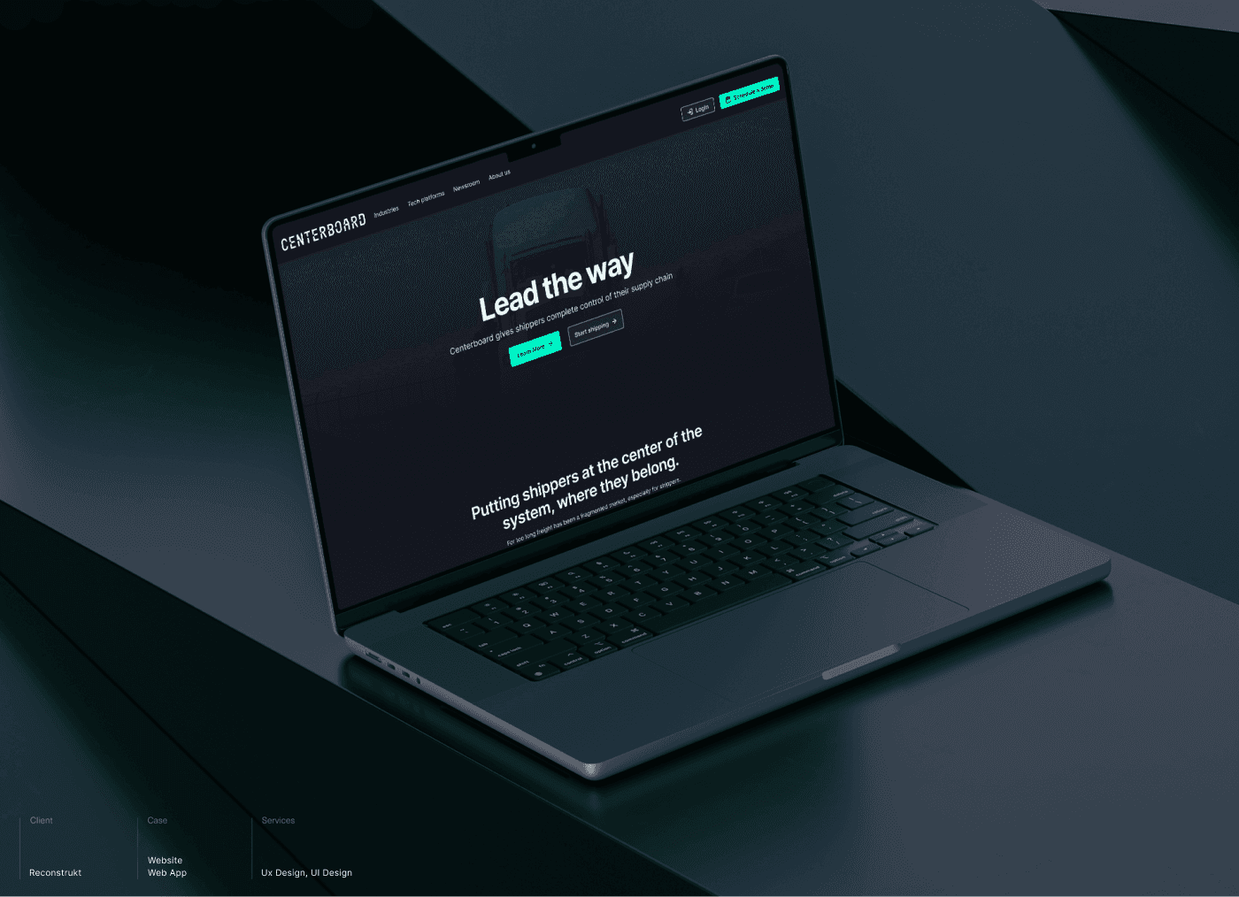
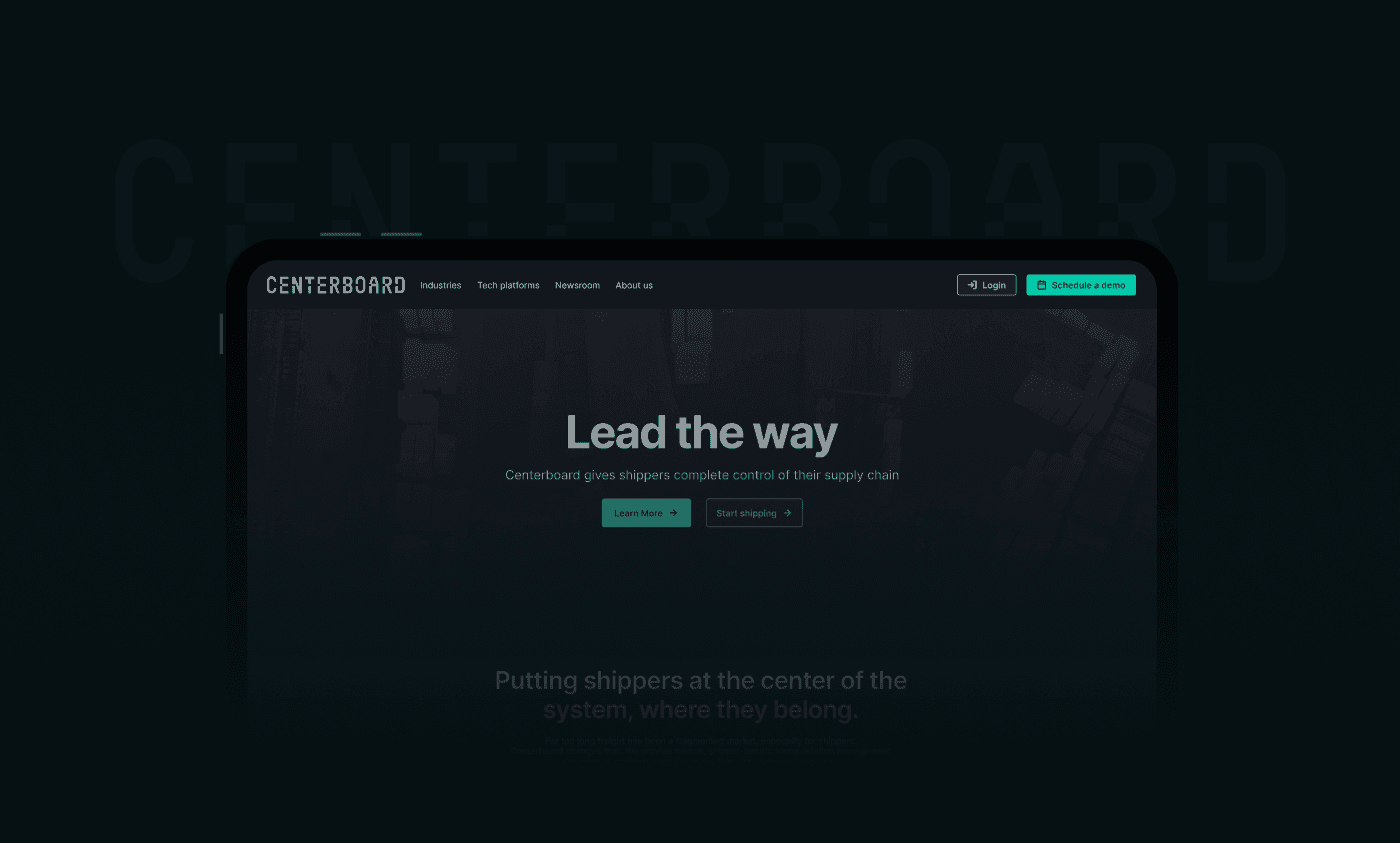
Centerboard
Centerboard is a transportation management platform built for North American shippers. Their customers, large industrial businesses moving high-volume freight, were managing carriers through phone calls, email threads, and spreadsheets. Duplicate entries. Misfiled quotes. Status updates that lived in someone's inbox until somebody asked. Centerboard's pitch is one place to plan, book, track, and reconcile every shipment. For that pitch to land, the marketing site needed to win the room, and the product needed to deliver on the promise once buyers were inside.
Two audiences, two surfaces, one product
The marketing site and the web app had different jobs.
The site had to convince procurement and operations leaders that Centerboard understood their industry. That meant industry-specific landing pages, social proof from named clients, and a clear story about integration partners (Banyan, Jitterbit, project44) for the technical buyer.
The web app had to strip friction from the shippers' daily work. Quoting, booking, document handling, notifications. Every flow had to be faster than the routine it replaced.
If we treated these as two unrelated projects, the brand and the product would feel disconnected to anyone moving from one to the other. So we treated them as one system from day one.
What I was working with
Three months. Two surfaces. One team to direct at Rekonstrukt, with a brand voice still firming up and a product UI still being defined.
Timeline meant we couldn't sequence the work classically (research, then IA, then design, then system). System and surfaces had to grow in parallel. That made the architecture decisions early in the project the most consequential ones, because everything downstream depended on getting them right the first time.
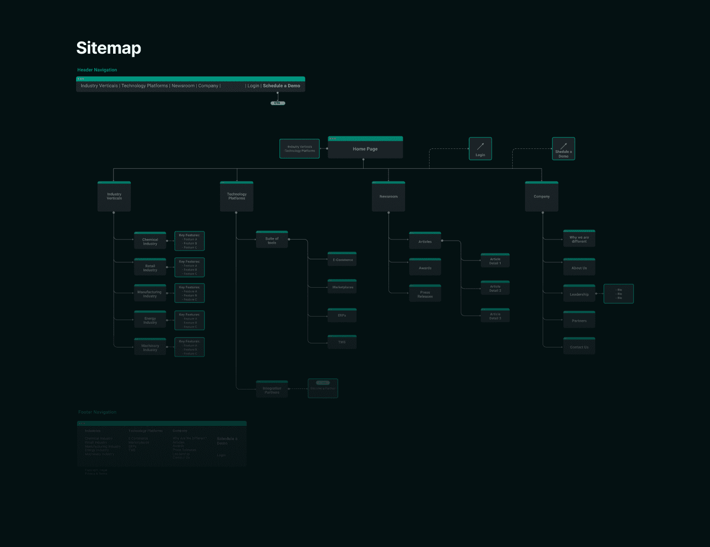
A sitemap before a single screen
Before any visual design, I mapped the full sitemap. Three decisions shaped it.
Lead with industry, not features. Shippers self-identify by industry first ("I'm in chemicals," "I move food and beverage"). Industry verticals became the primary navigation cluster, with tailored content for chemical, retail, manufacturing, energy, and machinery segments.
Give the platform equal weight. Tech platforms (the suite of tools, including marketplaces, ERPs, e-commerce, and TMS) got its own pillar in the nav because that's how technical buyers move through the site.
Treat integration partners as a credibility play, not a footer link. A dedicated section with logos and value statements, plus a Become a Partner CTA for the long tail.
The sitemap was the contract for everything that followed.
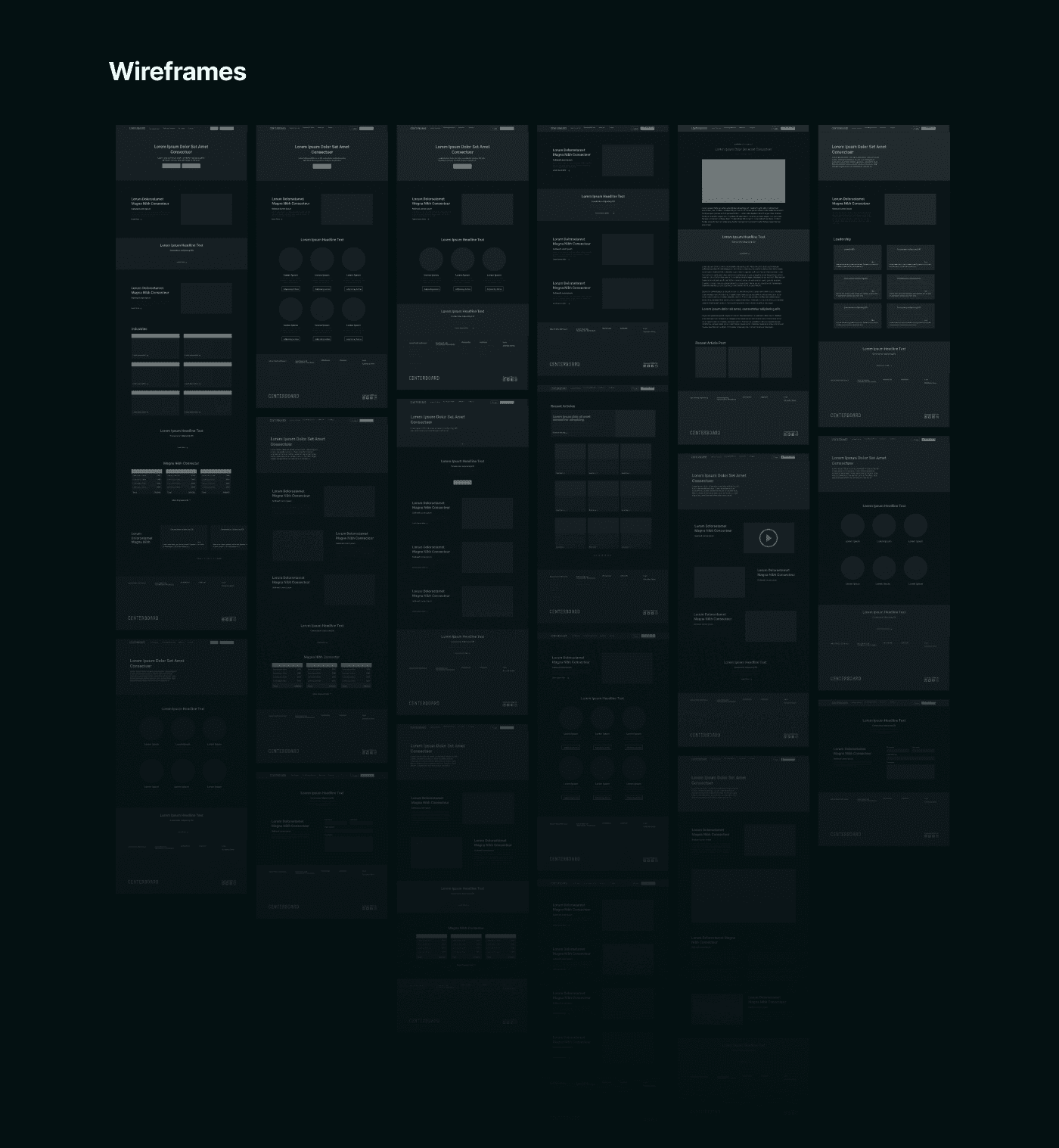
Pressure-testing the layouts
I wireframed every page across desktop and mobile before touching colour or type. This gave the team room to argue about hierarchy without getting distracted by visuals. Most of the rounds went into the home page (balancing the value proposition, the social proof, and the integration story without overwhelming a first-time visitor) and the industry template (one component, five fillable instances).
By the time we moved into hi-fi, the structure was settled.
The marketing site
The site brought Centerboard's pitch ("Lead the way") into a confident, dark-first interface that gave the brand the seriousness its enterprise buyers expect.
The pages doing the heaviest lifting:
Industries. Five vertical landing pages off one shared template, each with industry-specific copy and imagery. This gave sales something concrete to send into a procurement conversation.
Tech platforms. A clear breakdown of the suite of tools so a technical buyer could understand what they were getting before booking a demo.
Integration partners. A dedicated section featuring Banyan, Jitterbit, and project44, with a Become a Partner CTA for the long tail of integrators.
Newsroom. Articles, awards, and press releases organised so the buyer can self-serve due diligence.

Inside the product
For the in-app side, the brief was explicit. Reduce the cognitive load of creating and managing a shipment. The decisions visible in this case study:
Step-based shipment creation to break a long form into a sequence the user can recover from if interrupted.
A summary panel showing every field the user has filled, so booking review is a glance, not a scroll.
A document preview popup for BOLs, manifests, shipping labels, packing lists, and the messier paperwork (blind, double blind, cross dock). Shippers select what to print after booking, instead of hunting through downloads.
An interactive notifications panel so status changes appear in context, not in a separate inbox.
Every component used here came from the design system. That was deliberate.
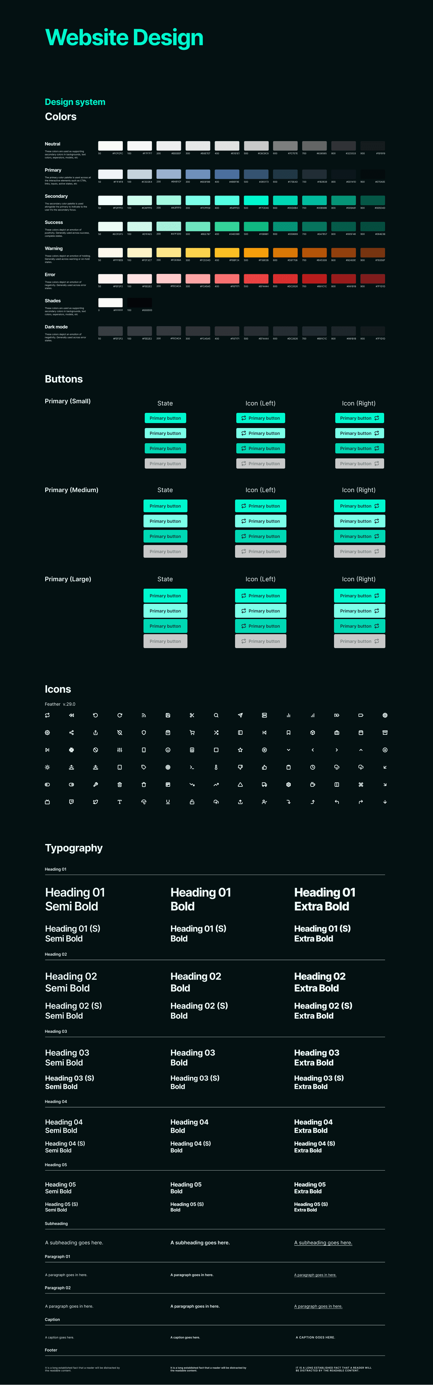
A foundation, not a coat of paint
I built the Centerboard design system to power both surfaces simultaneously. Components weren't a styling layer added at the end. They were the unit of work the team designed in.
What was in it:
Colour tokens across neutral, primary, secondary, success, warning, error, and a full dark mode set. Each scale ran 50 to 900 so we could pair foregrounds and backgrounds with confidence on contrast.
Typography scale from heading 01 through heading 05, with semi bold, bold, and extra bold variants, plus subheading, paragraph, caption, and footer styles.
Buttons in three sizes (small, medium, large) across default, hover, active, and disabled states, with left and right icon variants.
Icons standardised on Feather v.29.0, so designers and engineers pulled from the same library.
The benefit of doing this up front was that a designer joining mid-project could ship a new industry page or a new app screen without asking what colour the primary button should be. Engineering implemented against a stable contract.
What I took away from this
Three things stayed with me after this project.
1. Build the system before the product, not alongside it. Designing components and screens in parallel sounds efficient and costs you in retrofitting. On Centerboard, the system was set up first, which is why both surfaces shipped consistent.
2. Information architecture is product strategy in disguise. Choosing to lead the navigation with industry verticals instead of features came from how shippers describe themselves. That decision reshaped the home page, the templates, and the SEO play that came after.
3. Two audiences need two voices, but one visual language. The site speaks to buyers. The app speaks to operators. They can't sound the same. They have to look like the same product.
Credits
Designed at Reconstrukt for Centerboard.